App documentation
Indi’s Mental Model Dataset Visualizer (city skyline)
Here is the software to visualize a mental model dataset as a city skyline diagram. Feed your mental model data sheet to it and a mental model diagram (city skyline) will appear on the page. You can export it as an SVG file to load into a drawing tool. (The neighborhoods are currently not working yet.)
This generator is very simple. This little cousin generator is something I work on with a developer when we have time.
“I just wrapped up the first phase of a project that I was able to use your MMD generator on. The good news is we’re moving forward into development of the product – a medical device intended for use by school nurses. The generator saved me hours of work. Thank you!!”
Jonathan Morgan, June 2019, Balance Innovation & Design
Early at Adaptive Path we had a saying that we were helping our clients fall in love with spinach, riffing off the cultural joke that people don’t like to eat their vegetables. Anyway, we wanted our clients to really see the power of taking time to deeply understand the different people they were trying to support. Then, as now, orgs were in too much of a hurry to jump to a solution, to skip taking care of details. When they do see the power of qualitative research and deep understanding, stakeholders still look for ways to “speed it up” with Machine Learning (ML) and Artificial Intelligence (AI). But asking an algorithm to try to understand a listening session is like asking a robot to eat your food for you. All the nutrition of understanding the data will be washed away. The nuances of the transcript, untangling what was really meant over the course of paragraphs, and creating clear summaries that capture the wry language and quirky personality of each participant is what your brain needs in order to understand. Maybe there is a reason to speed up one part of data synthesis, like finding interior cognition concepts (rather than exterior layers) in a transcript, and that could give researchers a start. But, finding the affinities between the concepts based on focus of mental attention (not using other top-down affinity techniques like noun-tags, context, sequence, or keywords) would be impossible for an AI. Focus of mental attention is based on meaning, and AI can’t do meaning yet. It can only do statistics about words.
This diagram generator does not do any analysis or synthesis of your data. You must do that yourself. (Or hire Indi’s team to do it.)
diagram format
The software produces a diagram that looks like the city skyline below. It is the top half of a whole opportunity map. You can choose parameters for all the rectangles and fonts in the diagram, as well as control the colors in the boxes using data points on a second tab in your spreadsheet. After you generate your diagram, it appears at the bottom of your browser page. You can then download it as an SVG file.
Download this example spreadsheet to try it out.

Peek at the videos that explain this research example.
- Eat, Smell, Prey: detailed look at how the data was collected and analyzed
- SHORT: Eat, Smell, Prey: Opportunity Maps for Canine & Feline Fur People
- Complete 30 minute version of the video
* datasheet format
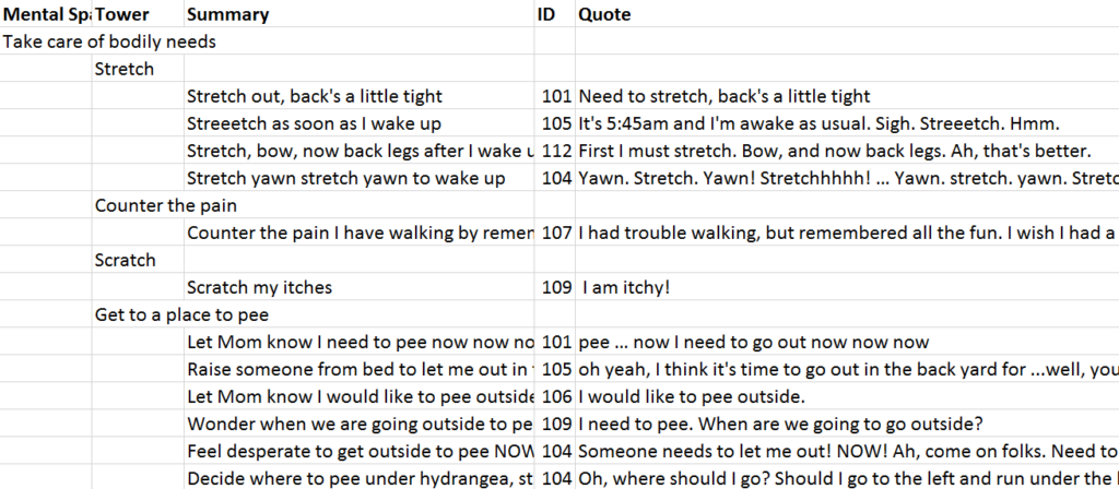
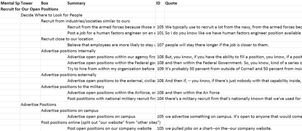
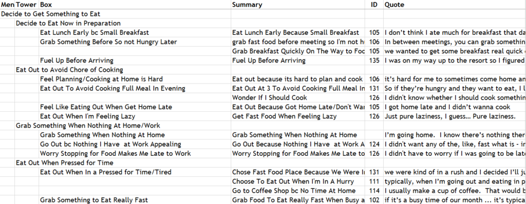
The software expects your data to be in a certain format. It looks for a spreadsheet where the first three columns represent the labels that make up the mental spaces, towers, and summaries of the mental model diagram (blocks, towers, and windows of a city skyline).
In many people’s sheets, the boxes are the summaries you’ve written to clarify what the participant was trying to convey.

You can also add a column if your data set is large, collecting several summaries into one box.

The rows can appear with spaces where you like them.

I have tested it with Excel spreadsheets and CSV files, but not with other types of sheets.
There can be other tabs in your sheet, and this diagram generator will look for the first tab that contains this format style.
colors & fonts
There are two ways to put color in the diagram and one way to change the fonts.
- The page containing the (somewhat primitive) interface allows you to change the color and font of every mental space at once, or every tower or every box.
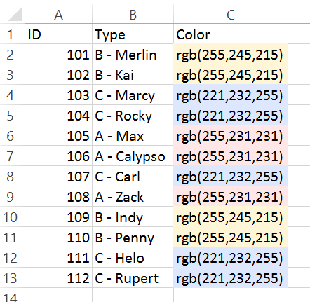
- However, if you would like to color the boxes according to a data value, the diagram generator will look for a tab in the spreadsheet that looks like this. You can name this tab anything you like, but the colors must be specified either in RGB or Hex format. If this tab is present in the spreadsheet, it will override the color set in the interface, above.

This color assignment tab works based on the ID column. You can assign each ID a different color according to whatever value/type you want. (For example, by thinking-style segment or by concept type.) The color for each ID in the color assignment tab gets mapped as the background color of the box for each instance of that ID in the source data tab.

known issues
SVG: People who tested this file format were able to load it easily into Illustrator to add a legend and play a bit more with how the diagram appears. But SVG is a vector file format. The text withing the boxes become lines, so you cannot edit the text in Illustrator.
BROWSERS: Apparently different browsers handle the SVG image generation differently. This generator doesn’t behave itself on Firefox with respect to line-wrapping, but it is fine on Chrome and Safari.
PDF: My developer and I ran into a bit of an issue downloading a PDF due to the long horizontal nature of the image, and the existing apps would break it up into printable pages. To print a PDF, you will need to load the SVG file into appropriate software, e.g. Illustrator or Mural. (For Mural, give it a day to process all the data, otherwise the “immediate gratification” image will show up only as black in a PDF.)
