Google analytics’ foundation is an opportunity map
At the Emetrics Summit,on 08-May-2007, Jeff Veen finally got to talk about his work for the past year. Ever since Google purchased Measure Map from Adaptive Path, Jeff and his team have been designing the new release of Google Analytics. Jeff said the diagram helped him in two ways. First, the time it took to listen to people about the things they were trying to figure out gave him room to absorb the difficulty of the problem and understand all the perspectives, which in turn allowed him to design the right tool. Second, Jeff said that the diagram was a good political tool, “But not in the sense of ‘users said these things, so we should design this way.’ It was much more like, ‘Wow, these measure map guys have a rigorous process for something we don’t understand at all. Let’s give them whatever they need.'”
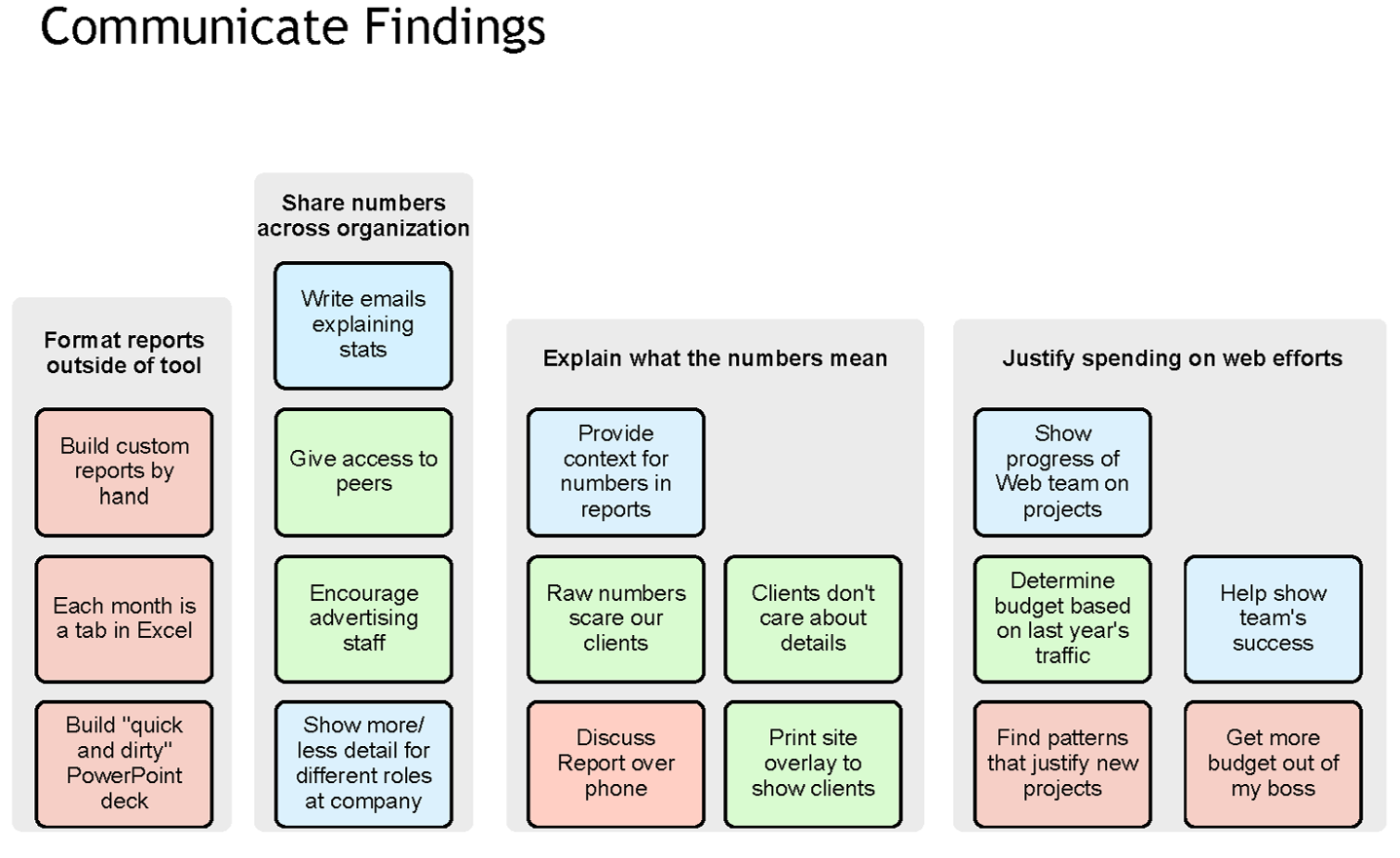
Here’s the mental model from Google Analytics that Jeffrey Veen referenced during his talk. His team explored the inner reasoning of a website owner, and recorded the things an owner wants to know. The mental spaces are:
- Understand My Visitors
- Analyze Incoming Traffic Sources
- Evaluate Site and Content Performance (or, how well the content meets visitors’ needs)
- Communicate the Findings (internally)

Here’s a peek at how the empathy that Jeff’s team built with website owners was influenced the services they designed. The last mental space, Communicate Findings, addresses the need for people who are watching the stats to tell other people at their organization about the knowledge they’ve derived from them.

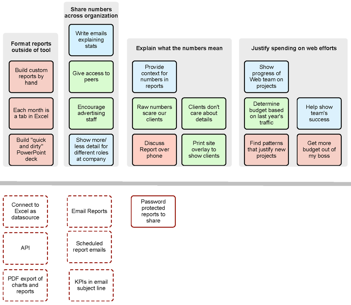
Below, the dotted-line boxes underneath the towers represent planned features. The solid line indicates a current feature.

Back in early 2007, the only existing way of supporting this whole mental space was a report that someone could give others the password to in order to go in and look at. This feature didn’t support the majority of what exists in the towers of this mental space, not to mention the security concerns about passwords. Jeff’s team recognized there was much more opportunity. They added several ways to export the data to other applications such as Excel or PDF to support the first tower. The Share Numbers tower has emailed reports and scheduled emails and talks about listing data like key performance indicators in the subject line. You get something in PDF format sent via email, where the subject line says something like 1500 unique page views. People can see things in a much better, clearer fashion.
This is a tiny peek one aspect of the vision that has come out of this mental model diagram. By listening to the stories being told by people about what they have to do in their own organization with regard to how well things are tracking on the web site, Jeff’s team could prioritize and focus their work.
